Lush
Rebrand of Lush Cosmetics
The goal of this project was to choose a company that needed a refresh or rebrand. I was challenged with building a new brand identity system and redesign of the Lush logo. Other deliverables included: a color palette, typography, stationary system, stylescape, and additional marketing collateral.
A 9 week class project: Emphasis on branding, brand identity system, and typography.

Brand Analysis
I started out this project with basic research to better understand the Lush's values and its place in the cosmetics industry. Following that, I put together a creative brief for myself which I would use to stay on the right path as I began building a brand identity system from scratch.


Using this new knowledge, I worked on a mind map and mood board to get ideas flowing without any limitations.


Logo Development
The bulk of the project entailed multiple rounds of iterations for logo marks. We were restricted to using only pictorial, abstract, or letterform styles rather than the more popular option of a word mark or emblem.


round 1

round 2

round 3

round 4

round 5
Final Visual Identity
black & white
color


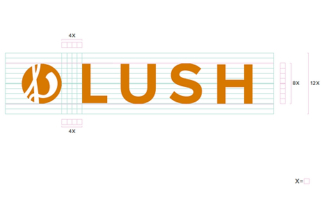
horizontal lockup
vertical lockup
secondary marks

color versions

color palette & typography
Final Statement
Lush prides themselves in doing more than the average cosmetics company. They have some of the most innovative products in the industry that are completely handmade and ethical. It’s not normal to see expiration dates on lotion or makeup. With a huge focus on sustainability, Lush prides itself in using no preservatives, being 100% vegetarian, and taking stances on issues like animal testing. Aside from that, their products are unique, vibrant, and make their customers more confident.
The original black and white wordmark did not encompass everything that Lush is and hopes to be. The new signature mark and brand system embodies Lush’s value and belief system. The orange-brown color was chosen to give off a rich, natural feel. The color speaks sustainability with its earthy tones.
Through their messaging and product design, Lush often emphasizes the freedom of movement. This is shown through the continuous ‘l’ line that tilts and breaks through the circle shape.
Finally, the simple 4 letters that spell out Lush were inspired by the old brand system. With small changes such as changing the typeface and widening the kerning, Lush can still retain their high quality and luxurious brand.


